Metal cards don’t “pop” because they’re shiny. They stand out because they feel inevitable in your hand, dense, cold, precise, like someone bothered to engineer the experience instead of just printing information onto plastic.
One-line truth: weight is a brand message.
And you can either use that message with restraint… or waste it with clutter.
Why metal cards hit different (and why people notice)
Hand someone a metal card and you’ll watch their brain do a tiny recalibration. The heft signals cost. The edge finish signals care. The sound when it lands on a table signals confidence (yes, sound matters).
Technically speaking, what you’re exploiting is multi-sensory perception: visual reflectance + tactile friction + mass. Plastic cards have one setting: “flat.” Metal has range.
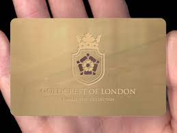
Curious how this manifests in real products? Check out this [metal card design](https://metalkards.com/order/metal-card-design/) for examples of finishes that maximize sensory impact.
Here’s a specific data point to anchor this: according to the U.S. Federal Reserve’s 2024 Diary of Consumer Payment Choice, cash use was about 16% of payments (Federal Reserve Bank of Atlanta, 2024). Physical objects still matter, even in a digital economy, and tactile cues still influence trust. A metal card plays in that same psychology: physical permanence, perceived reliability, “this is real.”
Now, that won’t apply to everyone, but in industries where trust is the product (finance, luxury, high-ticket services), metal is an unfair advantage.
Metals + finishes: pick a vibe, not a random material
If your brand identity is fuzzy, metal will expose it. The material won’t save you. It’ll just make the confusion heavier.
Common pairings I keep coming back to
– Stainless steel + brushed finish: modern, controlled, almost architectural
– Brass + satin or light polish: warm, confident, slightly nostalgic
– Aluminum + anodized color: lightweight, agile, startup-friendly
– Black PVD over steel: sharp, stealthy, but scratches become part of the story (sometimes that’s good)
Look, here’s the thing: your finish choice is as much about fingerprints and wear as it is about aesthetics. Mirror-polished anything looks incredible for five minutes and then becomes a forensic exhibit. Brushed hides handling. Matte coatings reduce glare but can mute contrast if your engraving isn’t dialed in.
I’ve seen gorgeous designs fail because the vendor didn’t test legibility under harsh overhead LEDs. Do the lighting test. Office lighting is brutal.
Hot take: most metal cards are over-designed
If I pick up your card and I don’t know where my eye should land within one second, you lost the whole point of going metal. Minimalism isn’t a trend here. It’s a usability requirement.
Metal wants restraint. Let it breathe.
12 design ideas that actually work (not just “cool”)
1) The brushed field + high-contrast logo (simple, lethal)
Brushed face, crisp laser mark, plenty of negative space. Pair it with a chamfered edge and you’re done. This is the “I don’t need to shout” card.
2) Beveled edges that catch light like jewelry
A small bevel reads as precision engineering. A bigger chamfer reads as luxury. The magic is what happens when the card rotates under light, suddenly your silhouette has depth.
Short section, but important: edges are branding.
3) Dual-finish zones (matte body, polished highlight)
Don’t coat the whole thing the same way. Give the eye a target: polished logo on a matte field, or a glossy stripe running behind your name. It feels designed, not decorated.
4) Microtexture grip areas (yes, ergonomics)
A subtle knurl or micro-etched patch where fingers naturally rest. People won’t consciously notice why it feels good, they’ll just keep handling it longer. That extra second matters.
5) Cut-through window (use sparingly)
A small geometric cutout, triangle, circle, slotted line, adds intrigue. Too big and the card becomes fragile or gets caught on wallets. I prefer narrow, intentional apertures that echo the logo geometry.
6) Debossed typography you can read with your thumb
Deep deboss on metal is satisfying. Also: it forces you to simplify your type choices, which improves legibility anyway. Win-win.
7) Laser etch + filled enamel (one accent color only)
If you want color, earn it. One color. Used once. Think: a thin line under the name, a tiny mark in the logo, an edge accent.
More than that and it starts looking like merch.
8) Edge coloring (micro-anodized or painted edge)
This is underrated because it’s subtle until it isn’t. A black or cobalt edge on a silver face reads premium immediately, and it doesn’t interfere with the main surface texture.
9) “Ghost” graphics that appear only in angled light
A faint, low-contrast pattern etched into the grain, visible when tilted, nearly invisible head-on. It’s the design equivalent of a private joke.
People love discovering it (and they show others).
10) Serial numbers or member IDs (tasteful, not “prison tag”)
Laser a small unique number on the back. Keep it quiet. This works brilliantly for clubs, premium tiers, limited runs, founders’ editions. It implies scarcity without begging for attention.
11) A deliberately oversized logo… with reduced contrast
Big logo, but done tone-on-tone. Brushed logo on brushed body, just rotated grain direction or shifted reflectivity. It reads expensive because it’s harder to produce well.
12) The “front is identity, back is utility” layout
Front: logo and maybe a name. Back: contact details, QR, compliance text, whatever you need. Two-sided metal cards get messy fast; this split keeps it civilized.
Texture: the part everyone likes but few people control
Texture is where metal cards become addictive. It’s also where bad production shows up instantly.
In my experience, the best textures aren’t loud. They’re consistent. A micro-sand finish that’s uniform across the face. A brushed pattern that doesn’t “swirl” unexpectedly. A knurl that doesn’t chew pockets.
Quick checklist (because it helps here):
– If it’s tactile, it must be repeatable
– If it’s decorative, it must be legible at arm’s length
– If it’s deep, it must be durable in wallets
Typography on metal: don’t get cute
Metal is reflective, which means thin strokes disappear at the worst times. Go a little heavier than you would on paper. Increase tracking slightly. Avoid hairlines, fussy scripts, and anything that relies on delicate contrast.
Opinionated note: one font family is usually enough. Two at most. The card isn’t a brochure.
Also, spacing wins. I’d rather see fewer details with confident margins than a dense block of “information” no one reads.
Engraving vs etching vs inlays (a specialist’s mini-brief)
These terms get mixed up. Vendors will sometimes blur definitions too, so be precise when you spec.
– Etching (often laser etch): typically shallower, great for fine lines and subtle tonal shifts
– Engraving (mechanical or deep laser): deeper cuts, stronger tactile feel, better for bold marks
– Inlays/fills (enamel, paint, resin): adds color or contrast, but introduces another failure mode if poorly bonded
Depth is not free. Deep cuts increase time, tool wear, and the chance of uneven passes. But shallow marks on a glossy surface can vanish under glare. So you balance depth, finish, and type weight like a three-variable equation.
Test pieces under: daylight, overhead office LEDs, and warm restaurant lighting. Yes, all three. People exchange cards in all three.
Micro-details and hidden messages (the recall hack)
A tiny mark in the corner. Coordinates on the back. A pattern that repeats your brand shape at micro scale. These details don’t sell the card immediately, they extend the interaction.
And the longer someone handles it, the more likely they remember you.
Keep the hierarchy clean:
– Primary info: unmistakable
– Secondary detail: discoverable
– Easter egg: only for the curious
Sustainability: real choices, not green theater
If sustainability matters to your brand, don’t just slap a recycled claim on a box insert.
Ask for:
– recycled content percentage (by mass)
– material origin documentation
– finish/coating chemistry (some coatings are nastier than people realize)
– packaging spec (plastic trays are common and totally avoidable)
Recycled metals can still feel premium. Done right, you won’t lose the “quality” signal, you’ll gain a credibility signal.
Production notes for 1-sided vs 2-sided (practical, slightly unromantic)
One-sided cards are easier to make look expensive. Two-sided cards are easier to make useful. Decide what you’re optimizing for.
A few non-negotiables:
– Safe margins: metal cutting and finishing can shift edges slightly
– Proofs that show real finish: digital mockups lie
– Edge spec: sharp looks cool until it slices fabric; softened edges feel better daily
If the card needs RFID/NFC, coordinate that early. Metal plays weird with antennas unless it’s engineered correctly.
Timeline and budget (how projects actually go)
Most delays come from two things: finish indecision and proof revision loops. If you want speed, choose a known finish and keep the design disciplined.
I typically recommend:
– one prototype round for feel + legibility
– one production proof for finish accuracy
– then the full run
If a vendor can’t show you tolerance ranges for engraving depth and coating durability, you’re gambling.
The last design decision that matters: restraint
Metal already communicates durability and permanence. Your job is to direct that power, not clutter it.
Make one thing dominant. Let everything else support it.
And if you’re torn between adding another element or leaving space, leave space (you’ll thank yourself when you see it under real light).